I spend a lot of time in the Mac OS X Terminal.app. Unfortunately, the built-in color schemes are all pretty terrible. I can’t stand to look at any of them for more than a few minutes.
So, one of the first changes I make on a new Mac is to update the default color scheme. It’s surprisingly easy to make something much easier on the eyes than the Basic theme. Here’s how I do it.
- On the Terminal menu, click Preferences
- Click Settings on the toolbar
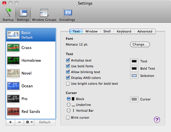
- Make sure the Basic theme is selected
- Now click the Gear, then Duplicate Settings
- Type the name Metal
-
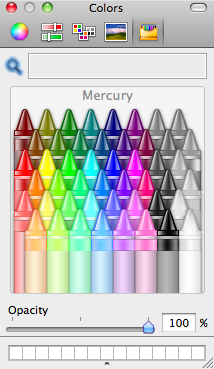
On the Text tab, change the Text and Bold Text colors to Mercury and the Selection color to Steel
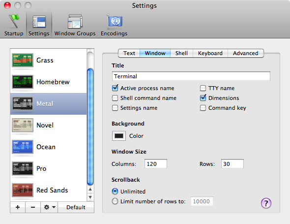
- On the Window tab, change the Background Color to Lead
- Finally, click the Default button
When you open a new terminal, you should see something that looks
more like this:
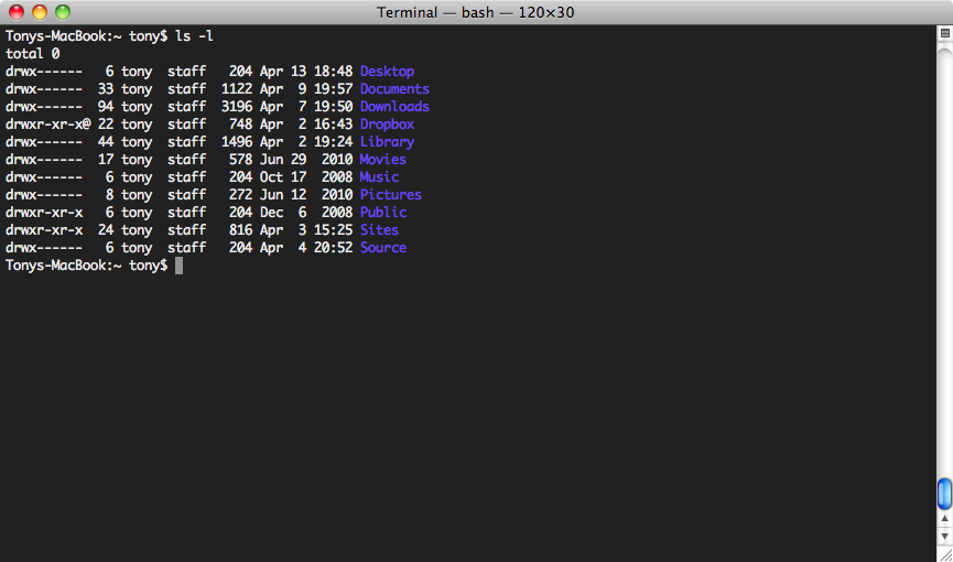
Now that is something I can work with for a while.